

CASE STUDY
Real-time SaaS for 10k+ oilfield sites, used by ExxonMobil, Chevron, and Marathon
MY ROLE
CLIENT
YEAR
WEBSITE
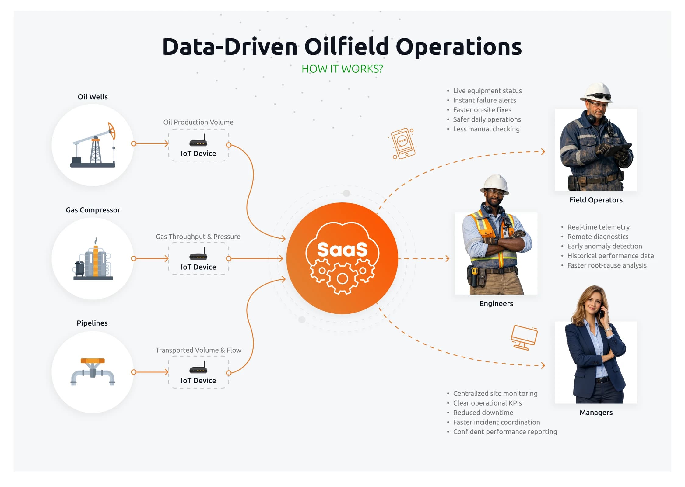
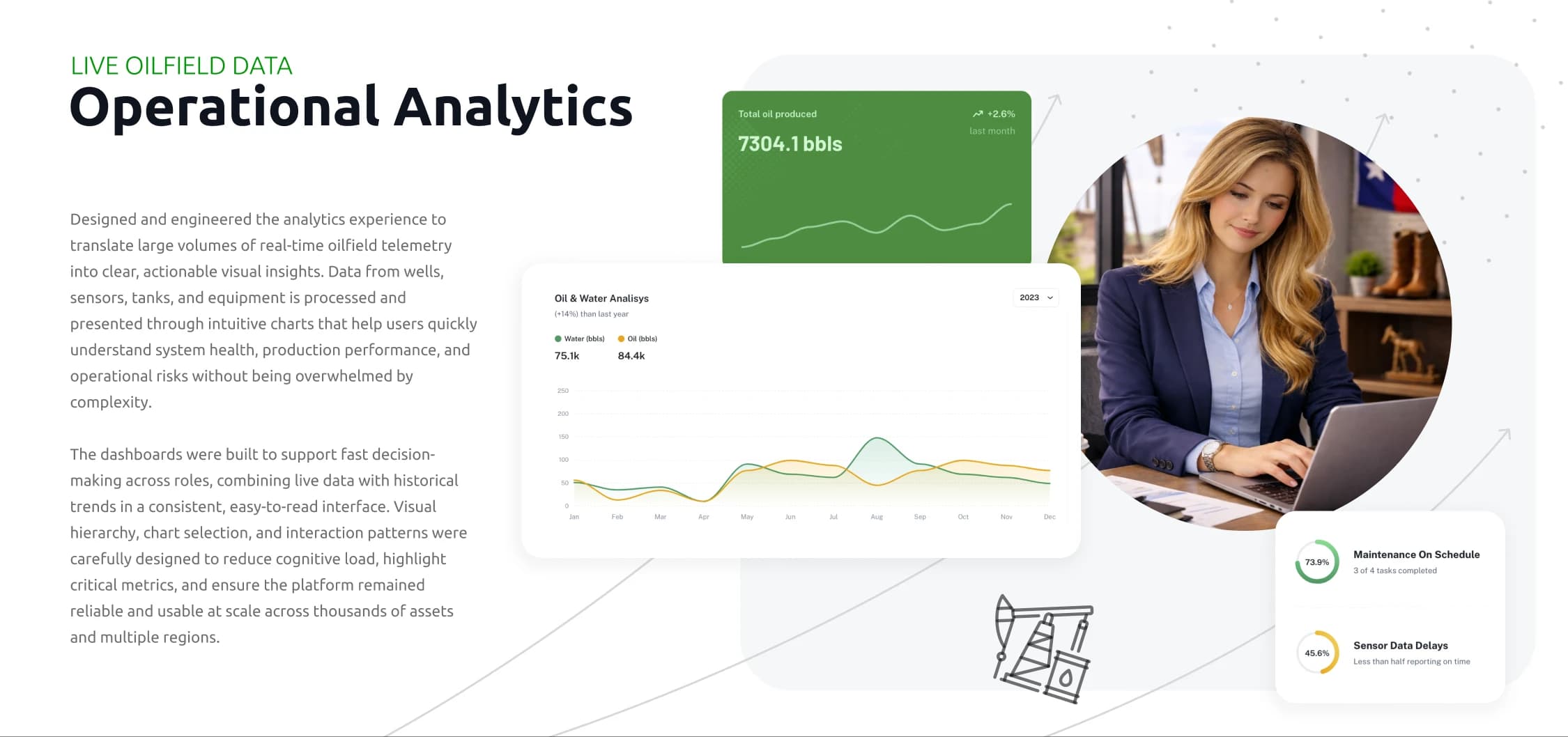
STEM Software's platform monitors oil production sites across the United States in real time. Thousands of pumpjacks, tanks, sensors, and remote cameras send IoT telemetry every few seconds. The operators using it work with ExxonMobil, Chevron, ConocoPhillips, Marathon Oil, and EOG Resources, and the platform has to stay clear, fast, and reliable under continuous data load. I joined as Senior UX Engineer in 2021 and was promoted to Lead Product Designer & Design Engineer in 2022. Across both phases I worked at the seam between UX, design systems, and frontend: research and dashboard design in Figma, shipped components in React and Next.js, and the architecture that connected them. The work covered live production dashboards, the alerting model, the nationwide interactive map, live video monitoring, and a custom reporting engine. Each one had to handle high data density without losing operator trust. What made the work hard was the load profile, not the feature list. Telemetry came in continuously from tens of thousands of endpoints, three audiences needed three different views of the same data, and the design system had to stay quiet under all of it. Most of the decisions came down to hierarchy: what surfaces immediately, what waits one click away, and what only matters when something is wrong.
10k+
Oilfield sites monitored in real time
200+
Design system components, Figma + React
~80%
Reduction in alert noise after redesign
200s → 10s
Custom report generation time
Challenges
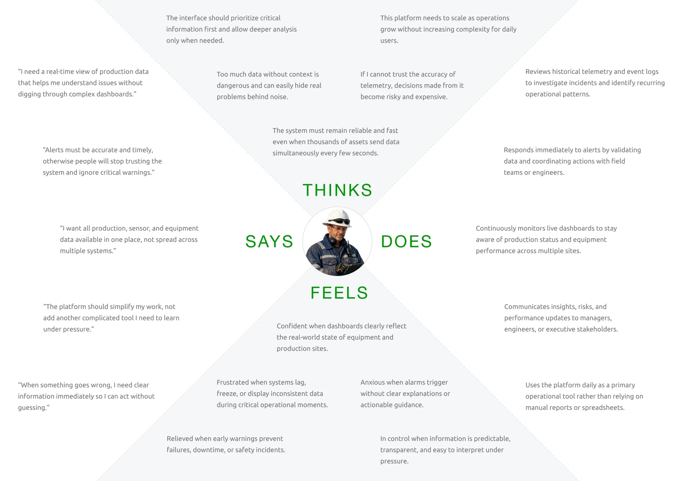
Data load. Thousands of sites pushing new telemetry every few seconds, three audiences (operators, engineers, managers) wanting different levels of detail, no unified hierarchy. Dashboards were carrying everything at once and hiding what mattered. Design system drift. Rapid growth had produced inconsistent components, duplicated logic, and unpredictable visual behavior. New features kept hitting the same UI gaps, which slowed engineering and made the product harder to scan. Alerts and reports were both broken in different ways. Operators were getting too many low-priority notifications and missing the important ones, which is an operational risk on a 10k-site platform. The reporting engine was fragmented: predefined reports that nobody trusted, and no way for advanced users to build their own without engineering involvement.
Solution
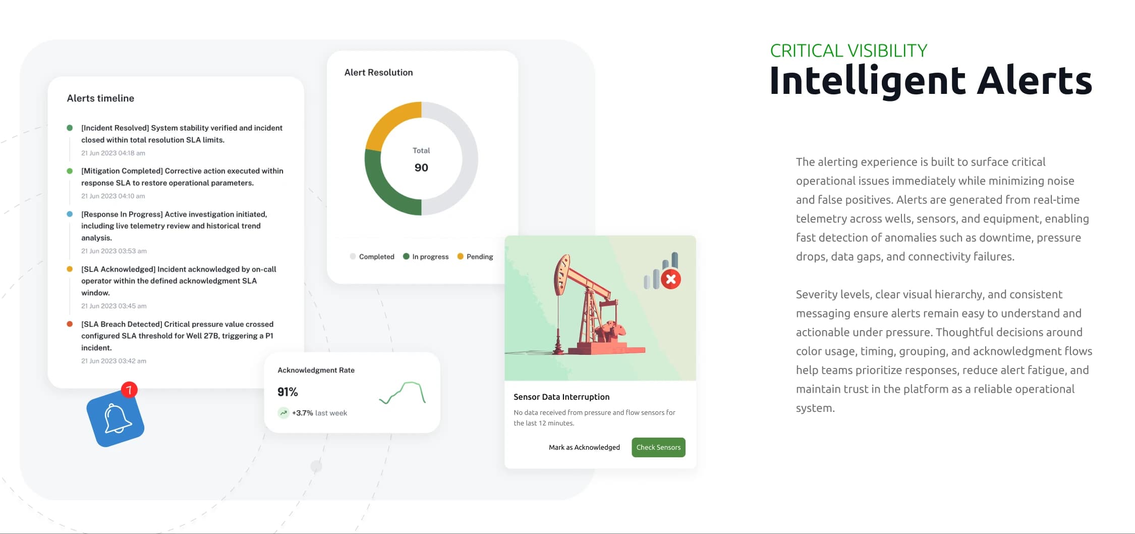
Started with role-based research: shadowed how operators, engineers, and managers actually used the platform under live data load, then mapped that into typed personas and three different default dashboard layouts. Built a Figma design system of 200+ components with a matching React and Next.js reference implementation. Tokens, charts, tables, alerts, and map elements behaved predictably under continuous updates. The same tokens lived in both Figma and code, so design and frontend stayed in sync without manual handoff. Redesigned the alert model with severity levels, smart grouping, and a unified alert center. Alert noise dropped by ~80%, and the critical-event flow became scannable in seconds. The interactive map got redesigned markers, status states, and quick-view panels so operators could manage thousands of sites without drilling into each one. The reporting engine split into curated predefined reports plus a custom builder that brought custom report generation from ~200 seconds down to ~10 seconds, with no engineering involvement.
STACK & TOOLING
FigmaReactNext.jsTypeScriptMaterial UIStorybook200+ component design system
Achievements
Summary
Across three years on this platform, the work covered the full arc: research, design system, alerting, mapping, reporting, and the frontend implementation that connected them. The redesign moved the platform from a fragmented internal tool to a SaaS product that operators trusted under real-time load. The hybrid approach (design plus frontend) reduced rework, made the design system genuinely shippable, and laid the foundation for the Lead Product Designer & Design Engineer role I moved into in 2022.
REFLECTION · What I'd do differently
What I'd do differently
- Build the typed entity model earlier. Some of the alerting confusion came from inconsistent state definitions across the codebase, not from UI.
- Treat the report builder as a product on its own from day one, not a power-user feature. It ended up being the most-used surface for advanced operators.
- Push for shared performance budgets between design and engineering from the start. Performance was healthy but always reactive instead of planned.