

CASE STUDY
A brand and site rebuild for a marketing agency that sells to home service owners
MY ROLE
CLIENT
YEAR
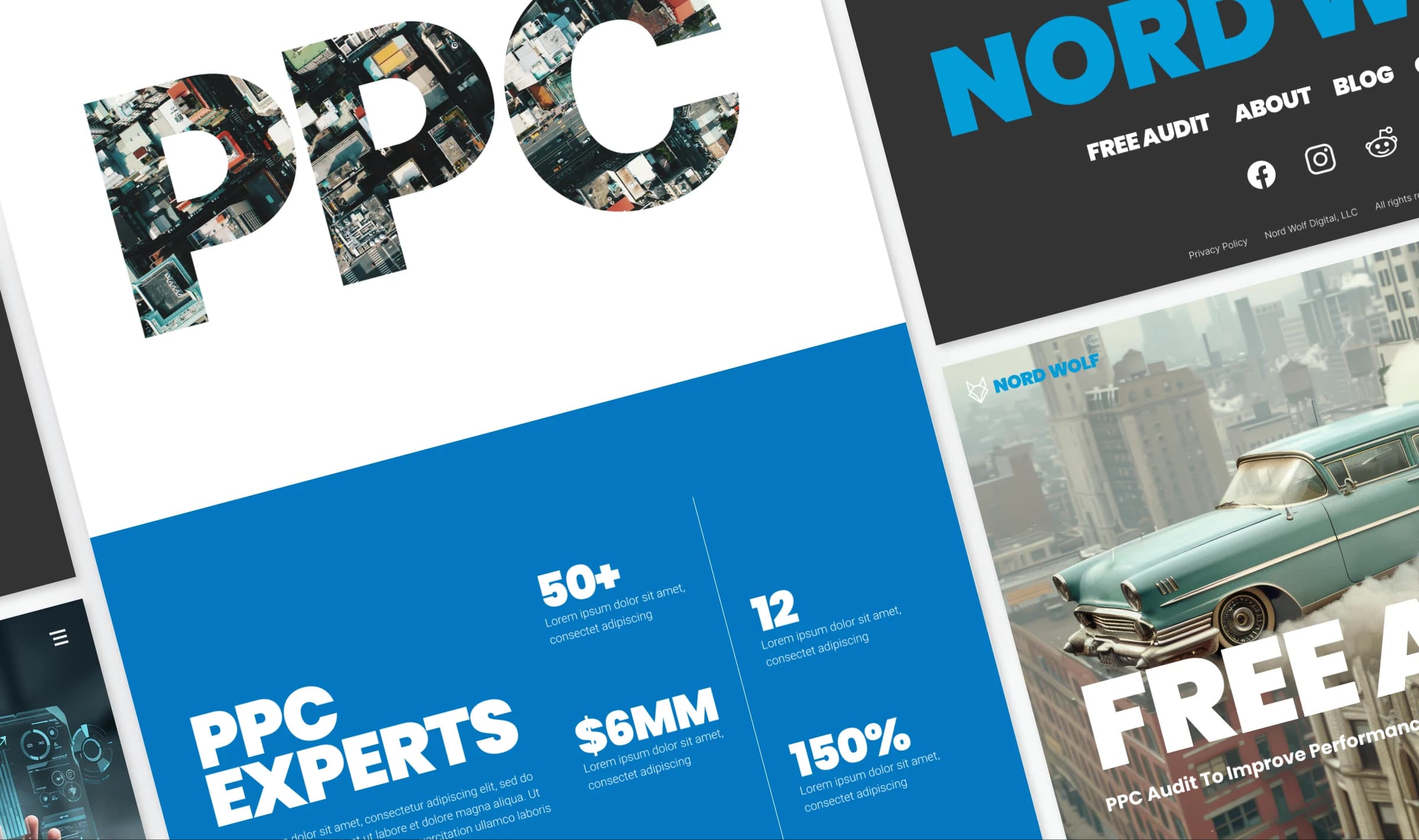
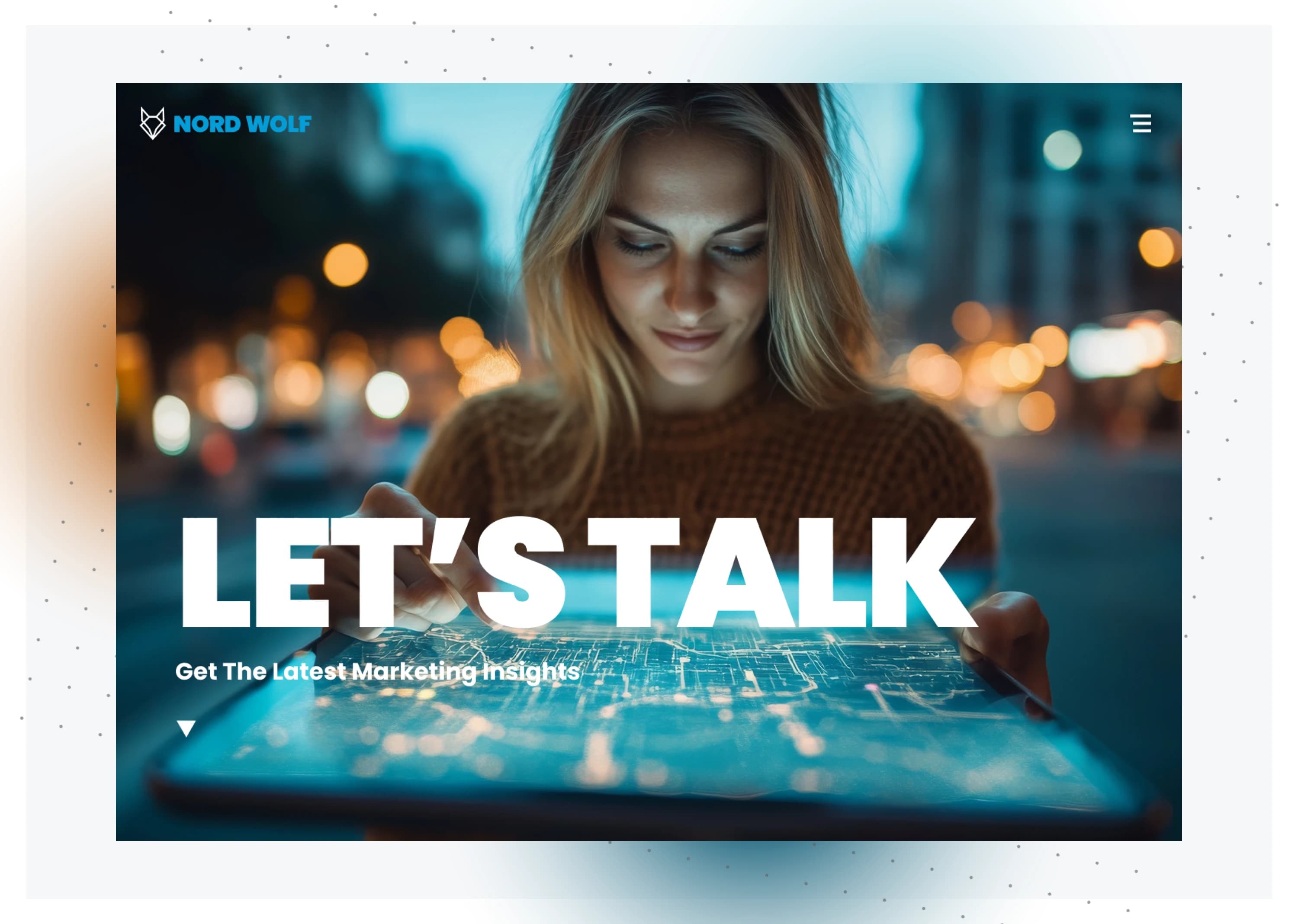
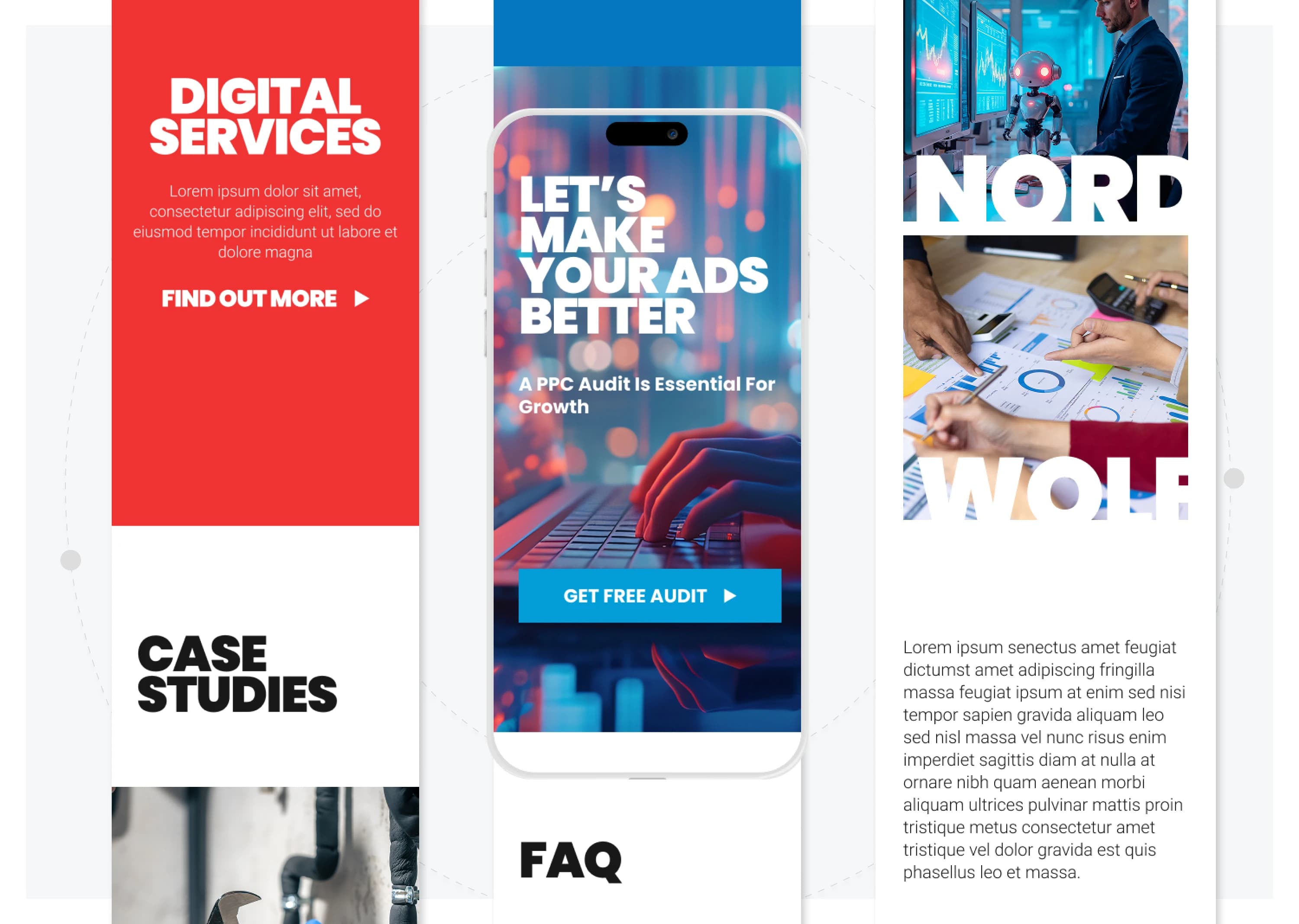
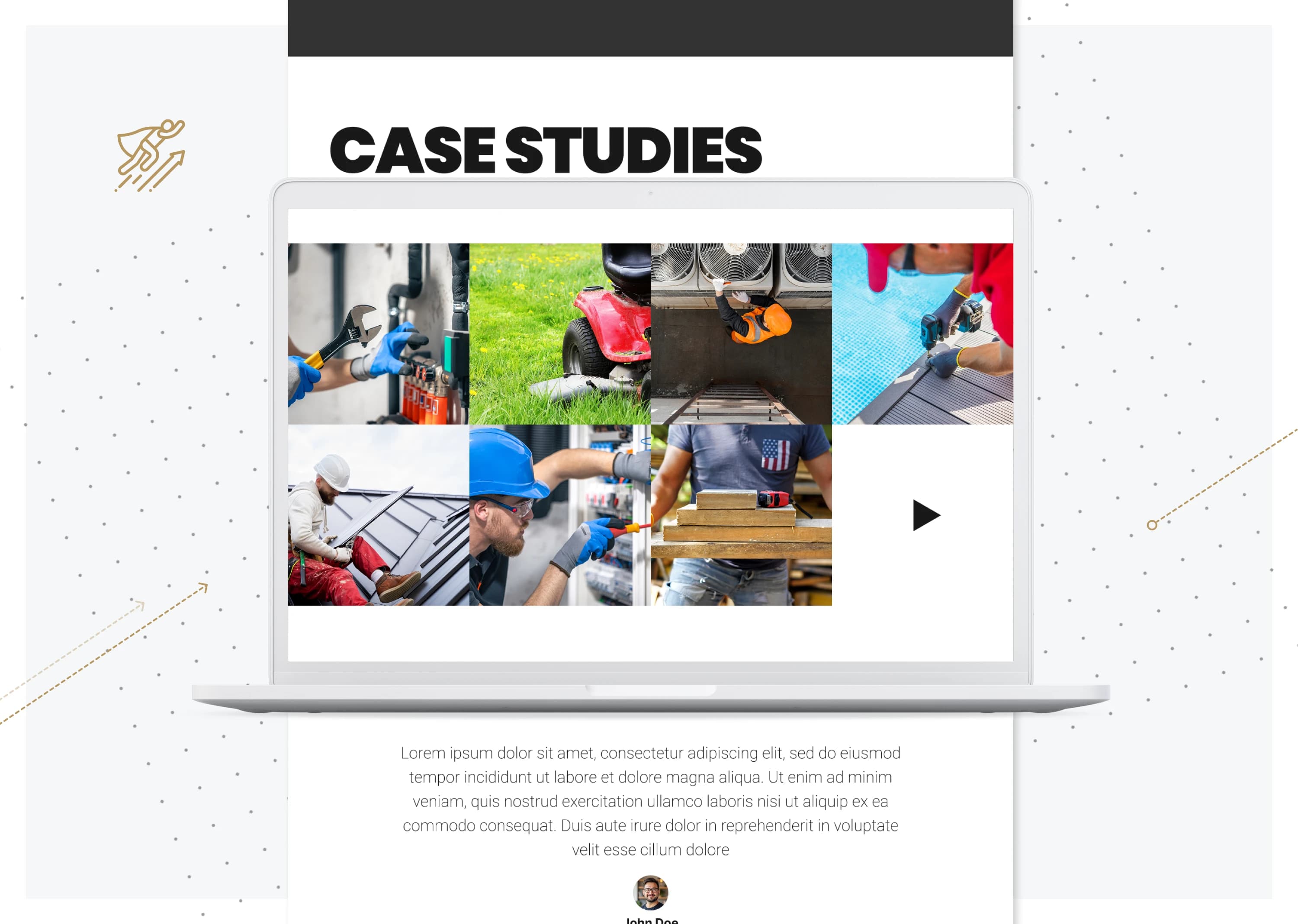
Nord Wolf Digital is a Texas-based marketing agency selling Google Ads, SEO, and websites to home service businesses: roofers, HVAC pros, plumbers, and remodelers. The work was solid, the old site didn't show it. Outdated brand, generic site, no proof of results above the fold. The rebuild covered the full stack: new logo, new visual language, a responsive design system, and a site built to convert busy business owners who don't read marketing copy. The hard part wasn't visual, it was credibility. Home service owners are skeptical of marketing agencies by default, and a generic-looking site reinforces the skepticism before anyone reads a word. The rebuild had to make trust visible above the fold and keep proving it down the page: real case studies with real numbers, a logo that read confident instead of clip-art, and AI-generated hero visuals that did the differentiation work most local agency budgets can't pay for.
~40
Components in the Figma design system
30+
Research and definition artifacts produced
2
AI image tools used for hero visuals (MidJourney, Nano Banana)
Challenges
The audience is skeptical, tired of marketing agencies that overpromise, and too busy running their crews to read long pages. The old brand looked generic and the old site couldn't carry the credibility the work deserved. The rebuild had to land trust fast: a sharper visual identity, a design system flexible enough to cover landing pages and campaign reports, and a content structure that proved the agency could deliver before asking for a call.
Solution
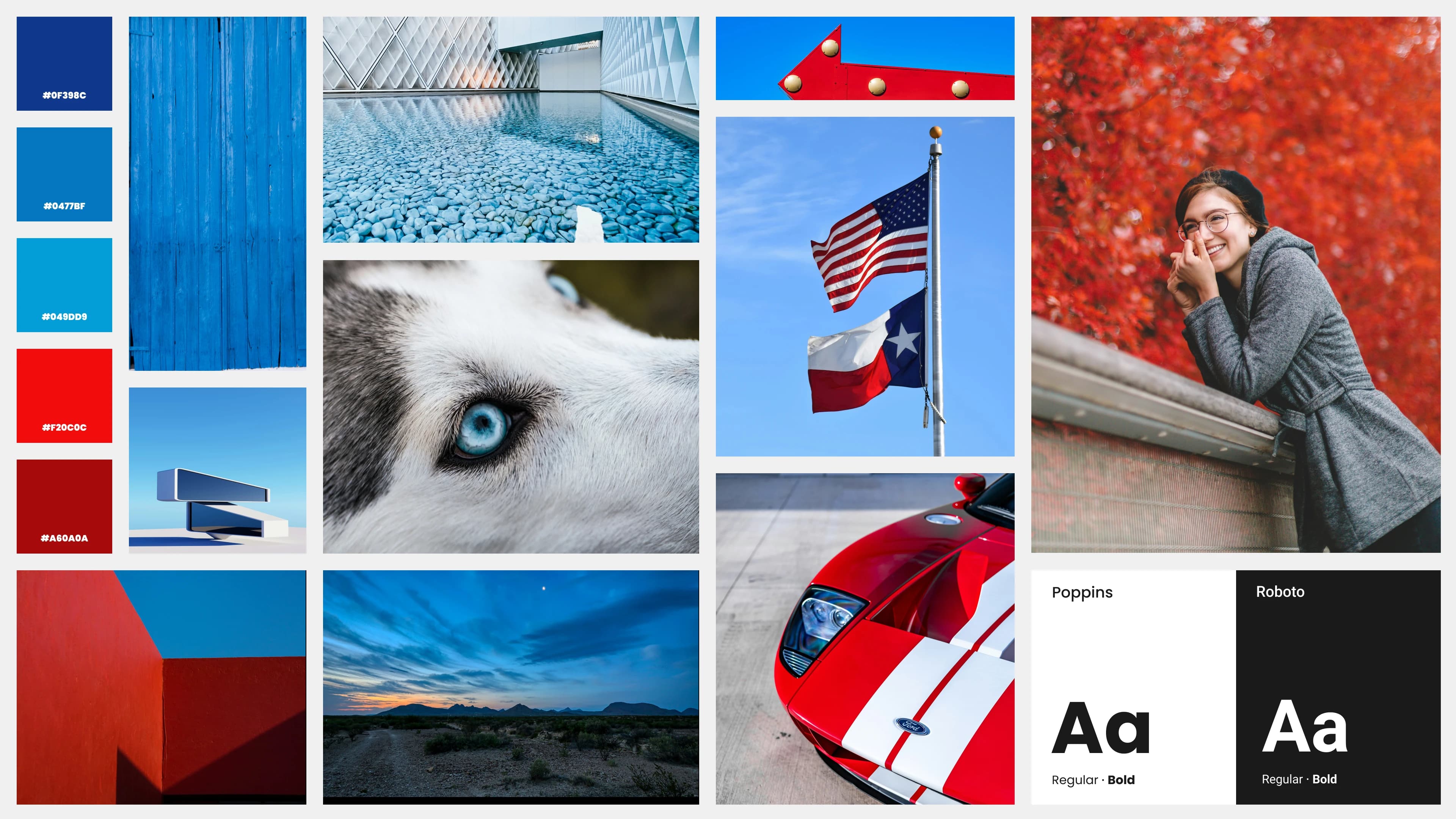
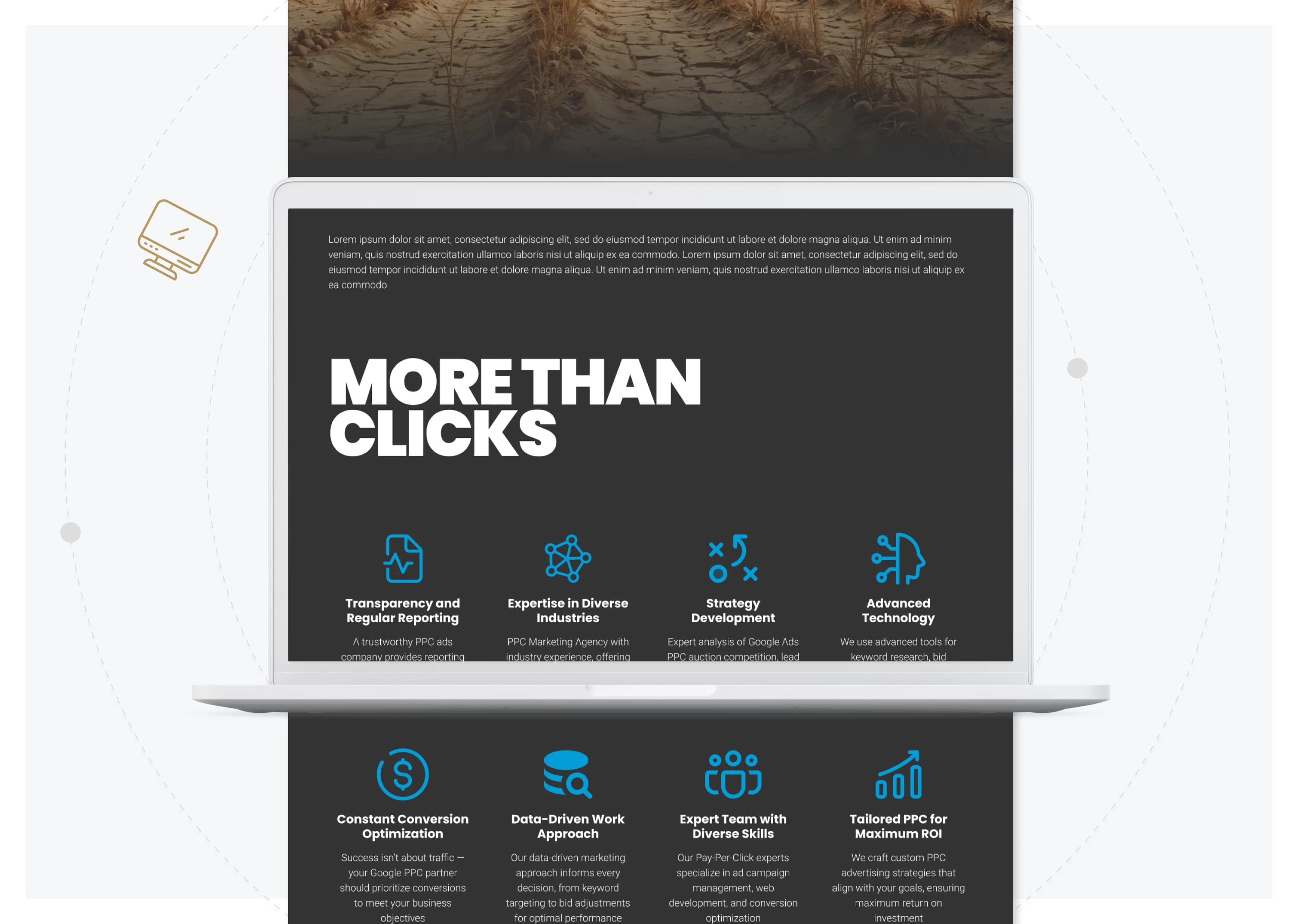
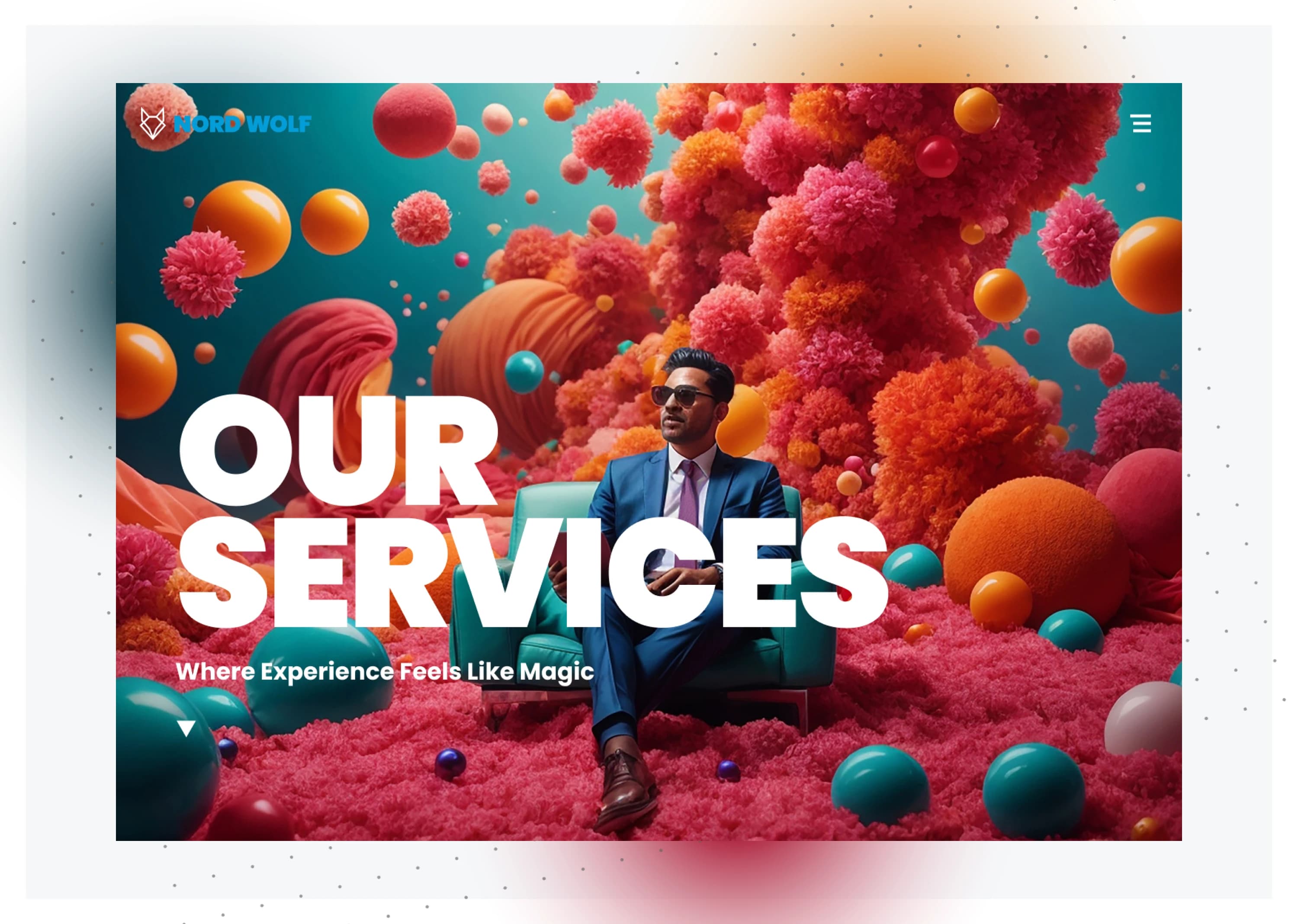
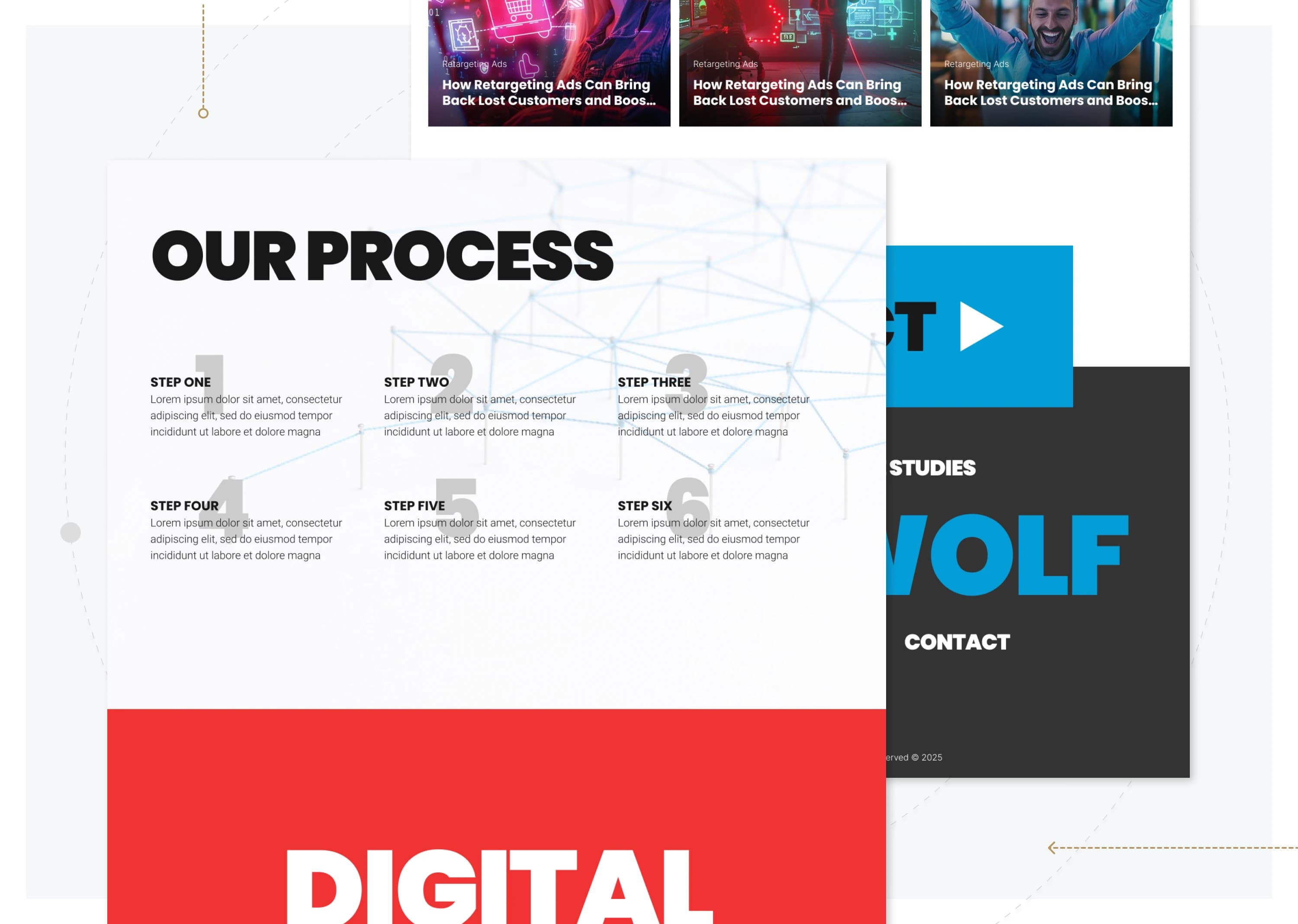
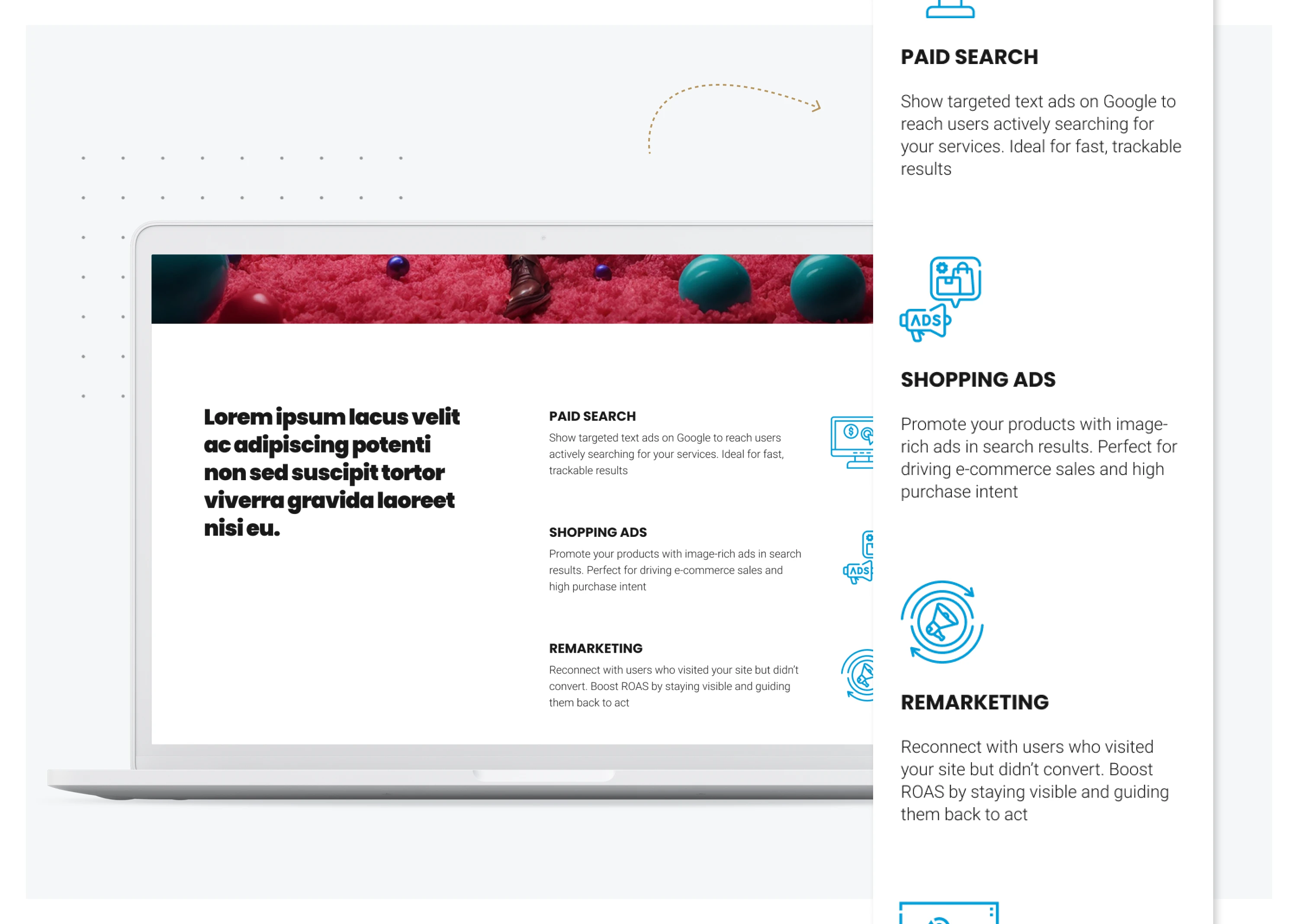
Built a new visual language around clarity and proof: a confident logo, a bolder palette, typography that signals competence without trying too hard, and a ~40-component Figma design system to keep everything consistent across landing pages, service pages, and reports. The site got fully restructured around the busy-owner reader: case studies lead with numbers, CTAs are low-friction, messaging is direct about lead quality and ad spend. MidJourney and Nano Banana handled the hero visuals (surreal, AI-native imagery instead of the usual stock-agency look), which gave the brand a distinct edge in a crowded local market.
01 /
STEP
EMPATHIZE
Design Thinking
Empathy Map
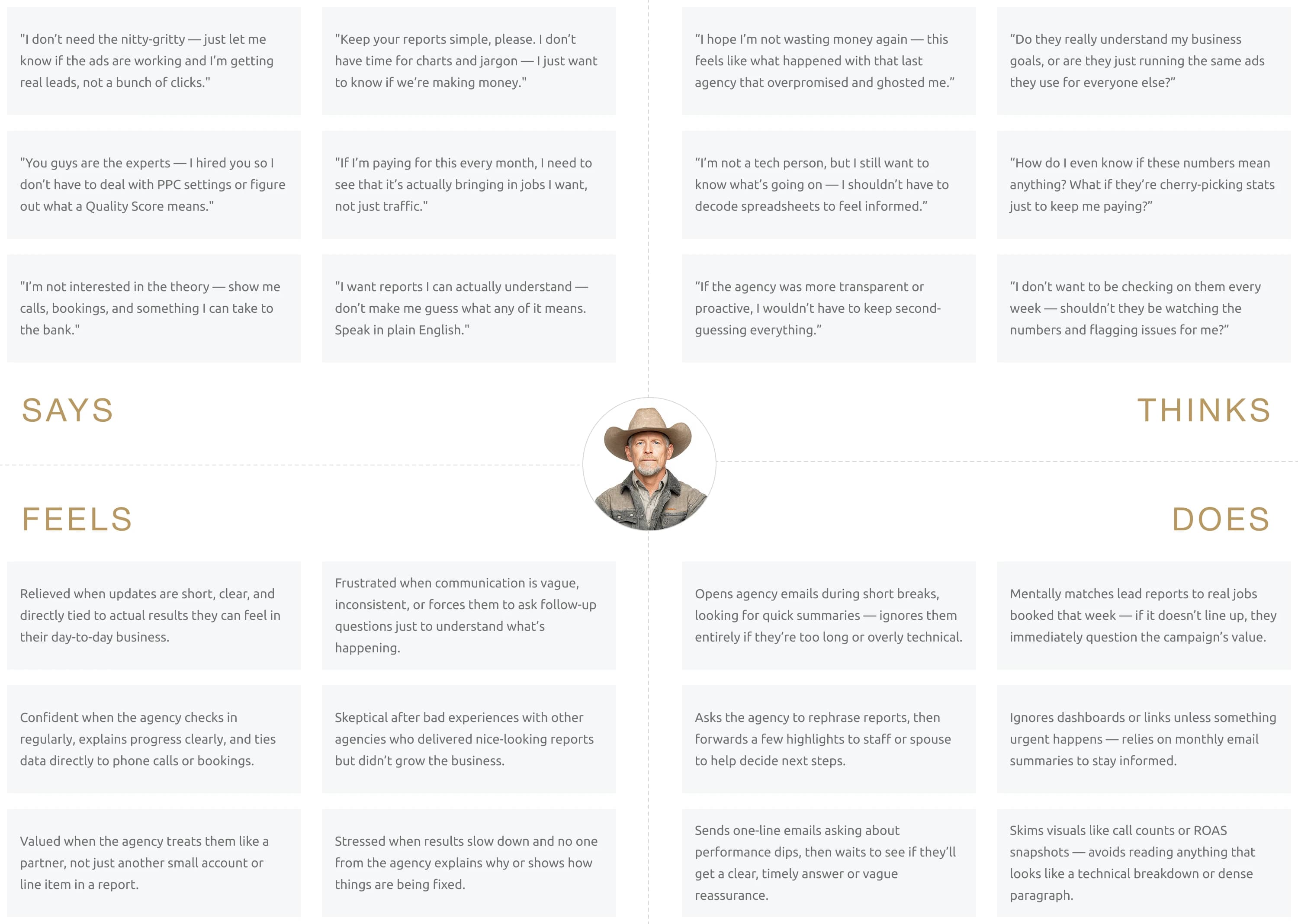
The map pulled patterns from voice-of-customer research and prior client work into one view: what owners say, think, do, and feel about marketing agencies. The signal was loud. Owners want results without hassle, hate jargon, and need proof in plain English before they'll trust anyone. That made plain language and visible proof non-negotiable for the homepage above the fold.
Audience Segmentation
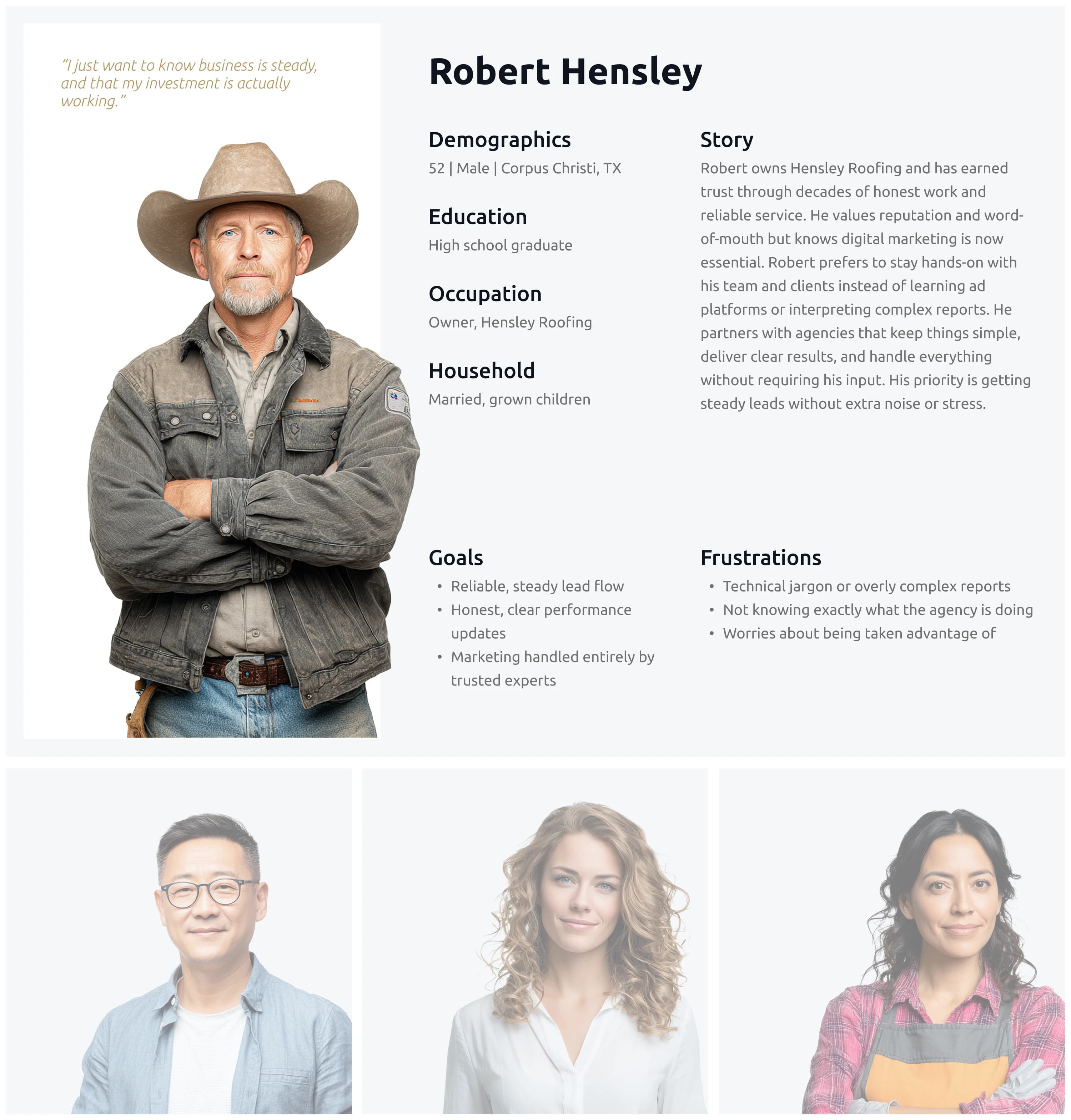
User Personas
Three personas, built from real client patterns rather than invented composites. One skeptical and burned-out, one too busy to read anything longer than two sentences, one analytical and wants reports. Each persona drove specific copy and CTA decisions: the skeptical owner sees proof first, the busy owner sees a one-line value prop, the analytical owner gets a clear path to a free audit.
02 /
STEP
DEFINE
Task Flows
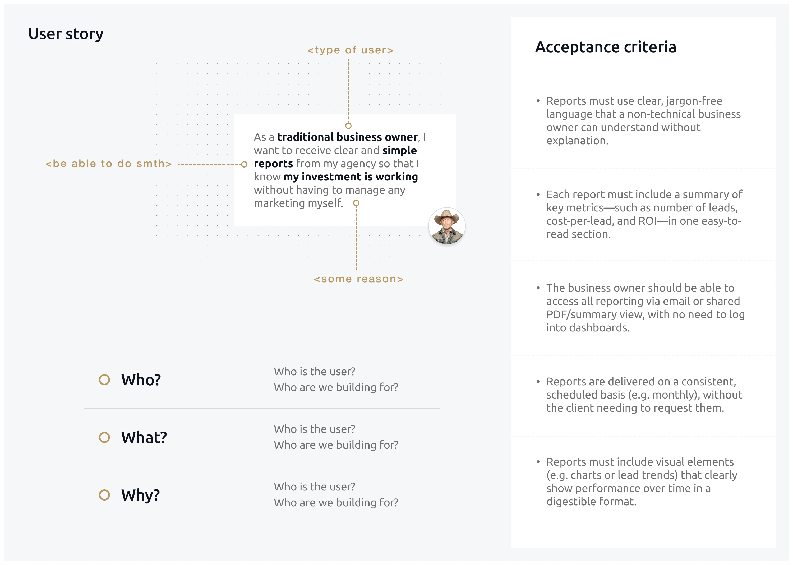
User stories & Acceptance criteria
Short, plain-language stories tied to acceptance criteria so design and engineering shared one definition of "done." Example: "I want to see how my ads are doing" → must include cost-per-lead, call tracking, and reports a non-marketer can read. Eliminated about a half-dozen pre-launch scope arguments.
UX Research
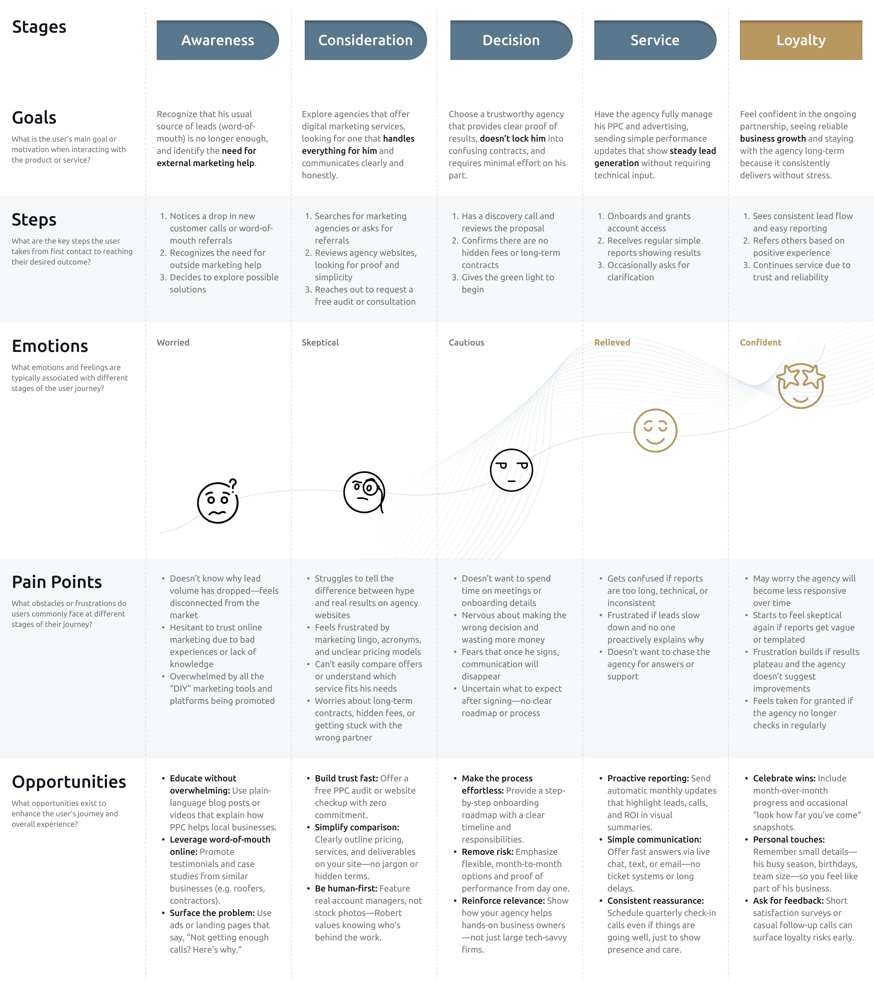
Journey Map
Mapped the full path from first awareness (word of mouth dries up, DIY ads stall) to first contact (case study → call → audit). Highlighted where trust was fragile (the moment after the audit form opens) and where the site needed to do extra work (case study pages with numbers above the fold).
03 /
STEP
IDEATE
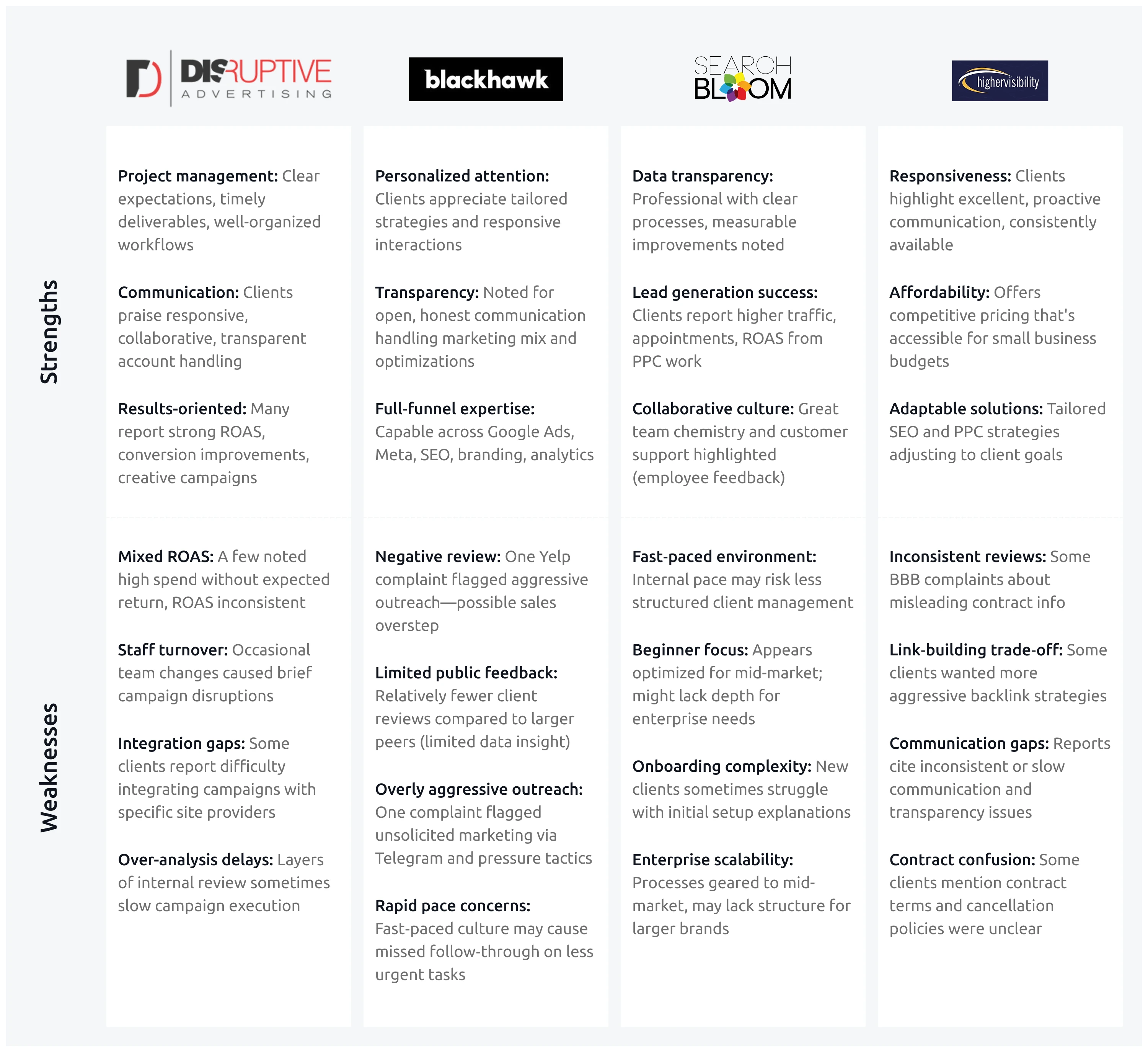
Competitor Analysis
SWOT Analysis
Strengths: hands-on, real PPC track record, local-services depth. Weaknesses: outdated visual identity, vague messaging. Opportunities: the rest of the market shares the same weaknesses (confusing dashboards, generic copy, no real proof). Threats: bigger agencies with bigger ad budgets but worse personal service. The strategy fell out of the matrix: differentiate on clarity and proof, not on scale.
Unique Benefits
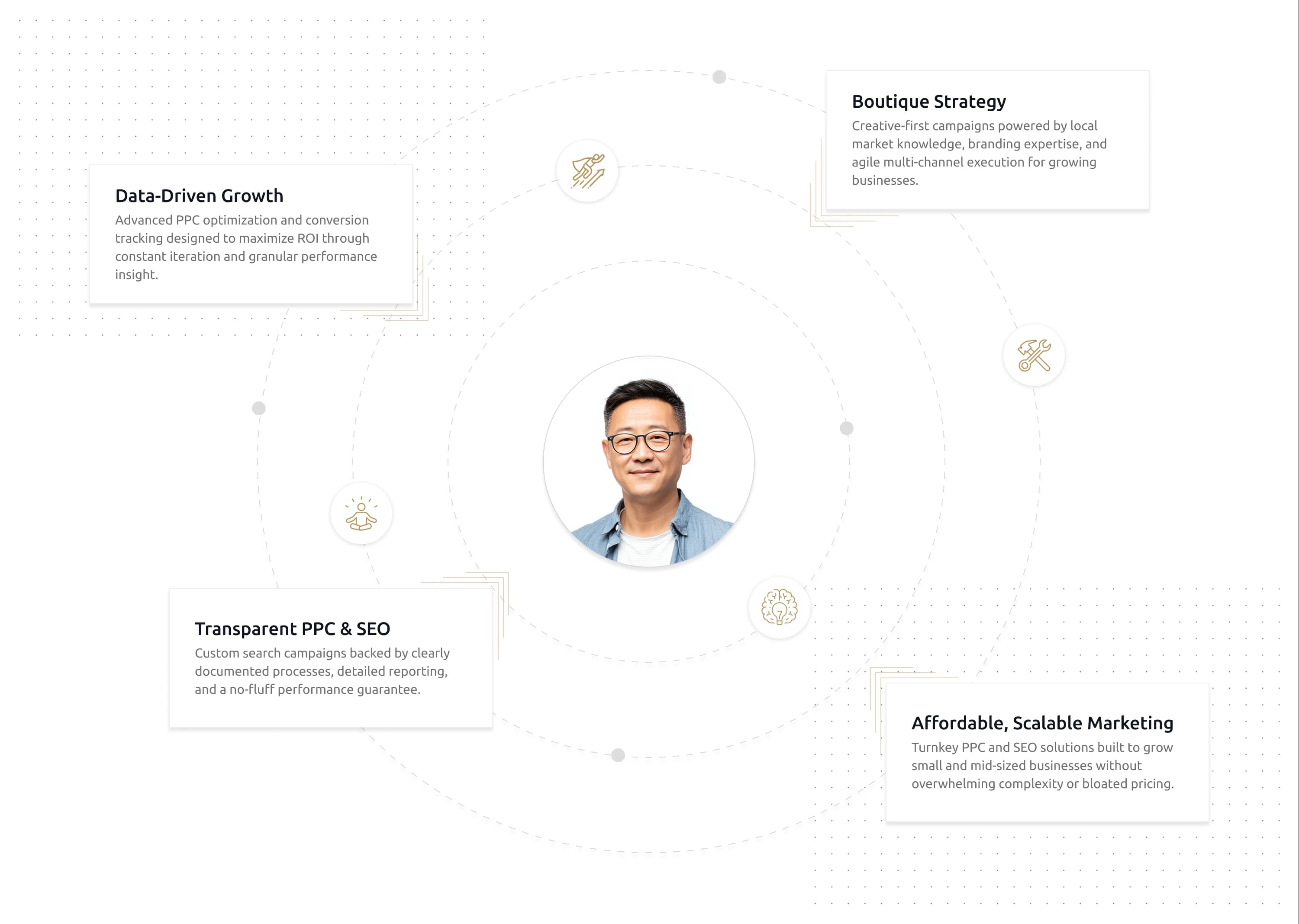
Value Propositions
Built around what business owners actually care about: better leads, lower cost per conversion, no jargon, real reports, real people. Two stacks: the rational stack (results, ROAS, cost-per-lead) and the emotional stack (peace of mind, transparency, a real person to call). Both surface on the homepage in different spots.
04 /
STEP
PROTOTYPE
Informational Architecture
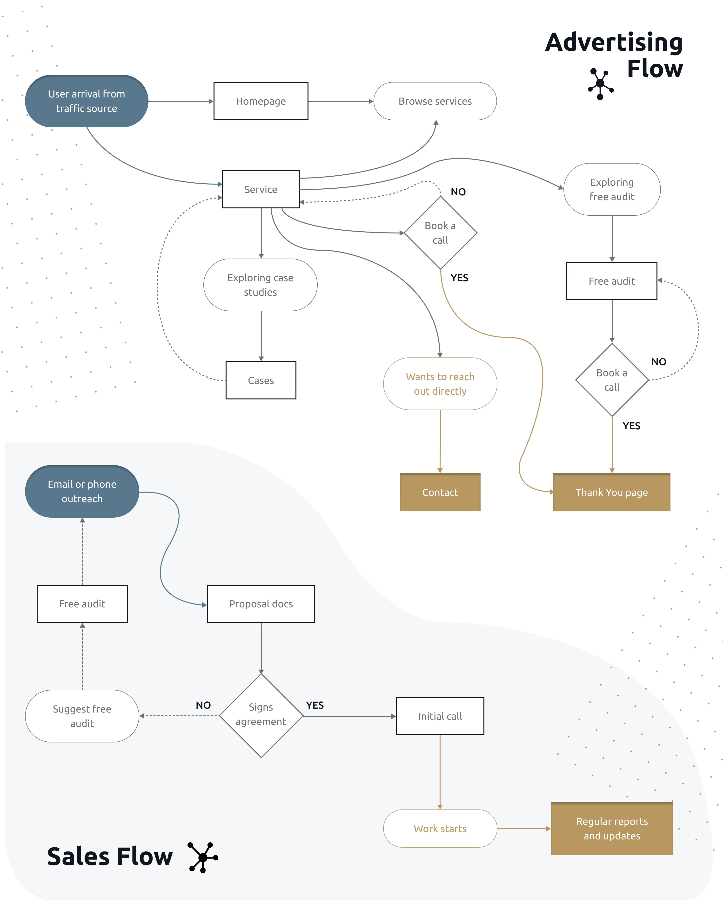
User Flow
Five core flows: ad-click landing, organic search → service page, case-study deep dive, audit request, returning client check-in. Each one ends in the same place (a low-friction form) but starts somewhere different. Mapping them out exposed two drop-off risks that got addressed in the wireframe stage instead of after launch.
Visual Narrative
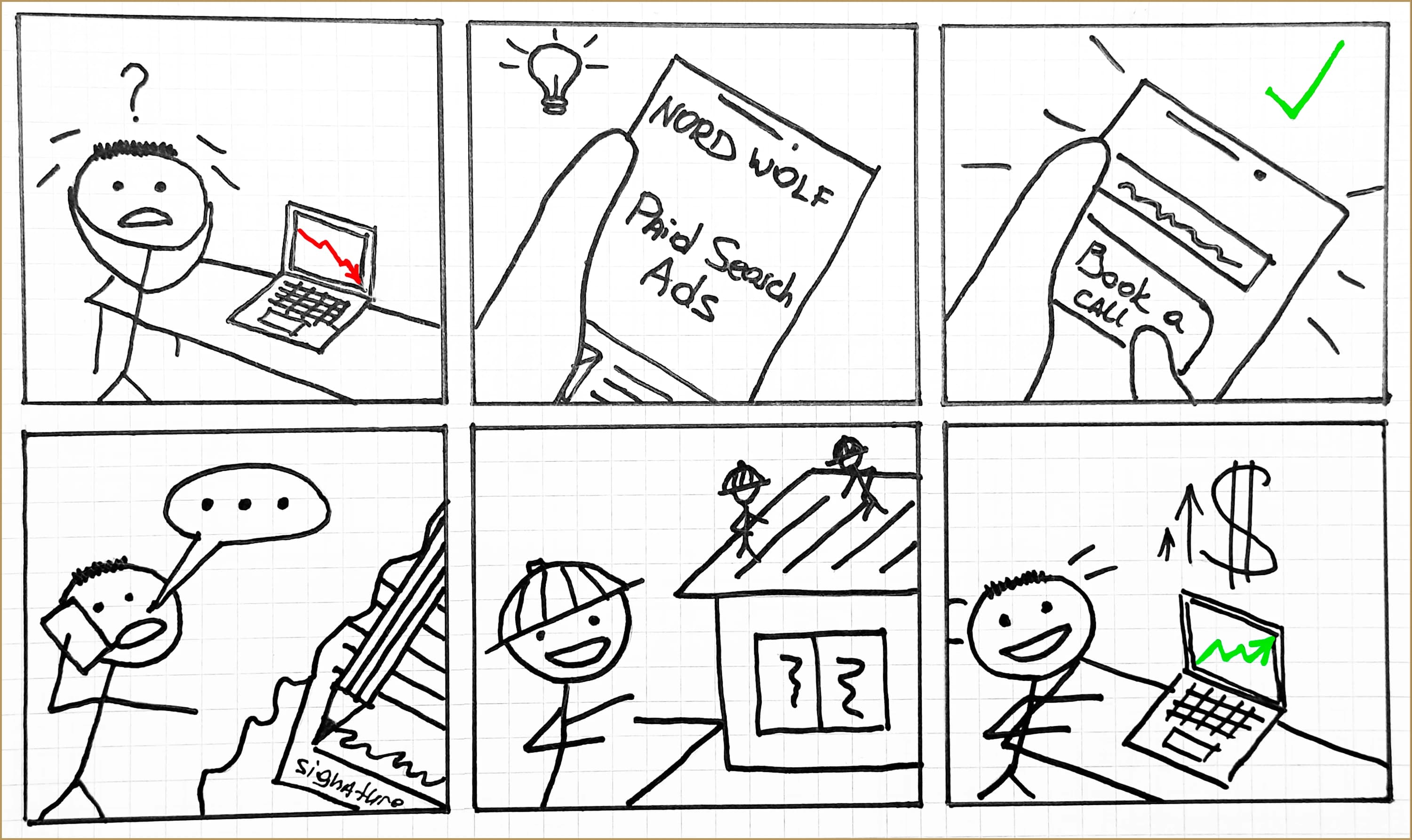
Storyboard
The storyboard ran a typical client (a roofer named in the persona work) through the brand from first frustration to first call. It's a synthesis tool more than an output tool. It mostly served to align design, copy, and dev on tone before the wireframes started.
Early Exploration
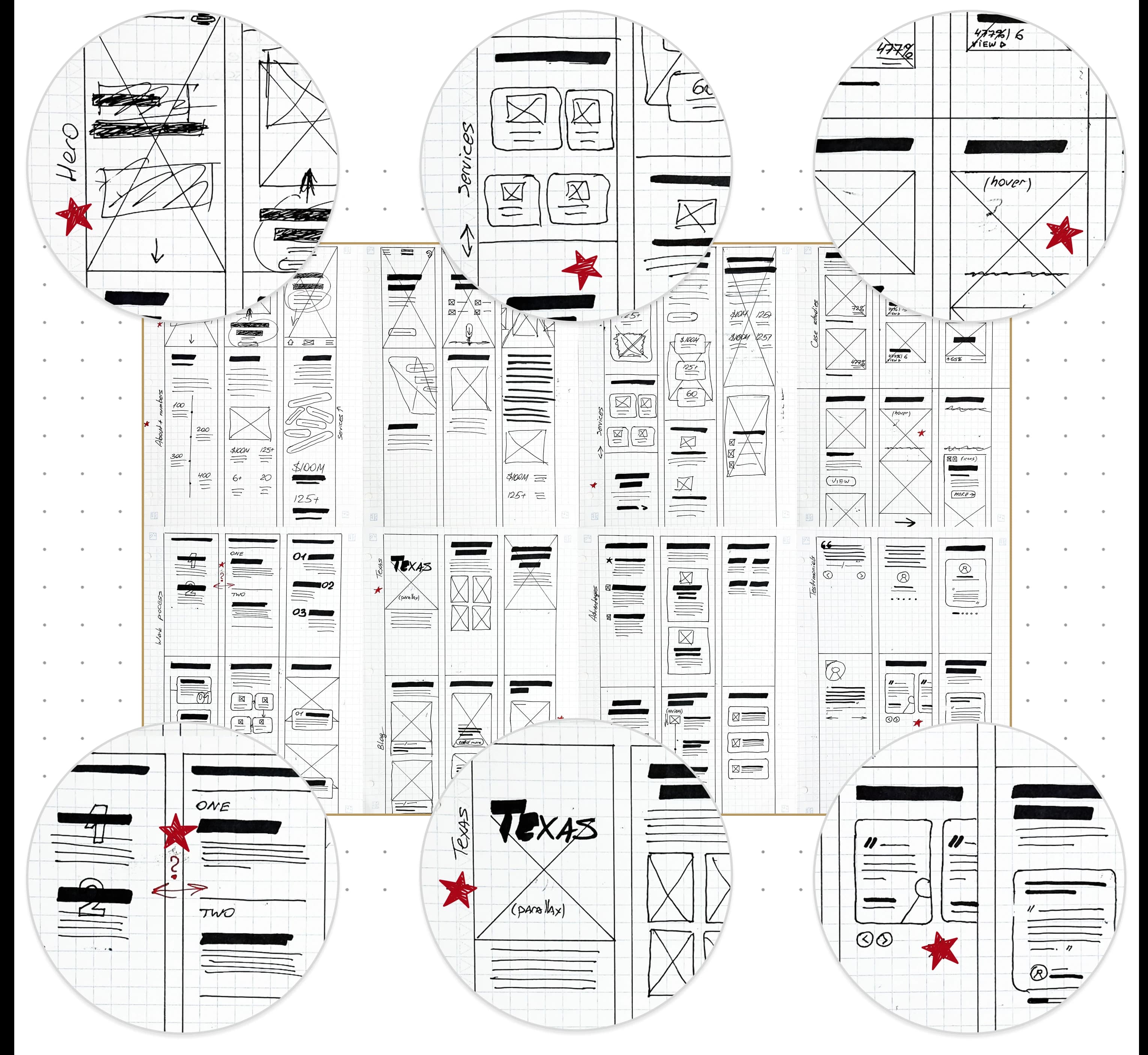
Paper wireframes
Rough sketches across the homepage, service pages, and contact flow. The point wasn't fidelity, it was sequencing: what loads first, where the CTAs sit, how the proof stack stacks. Tested half a dozen layouts in an hour each.
Content Architecture
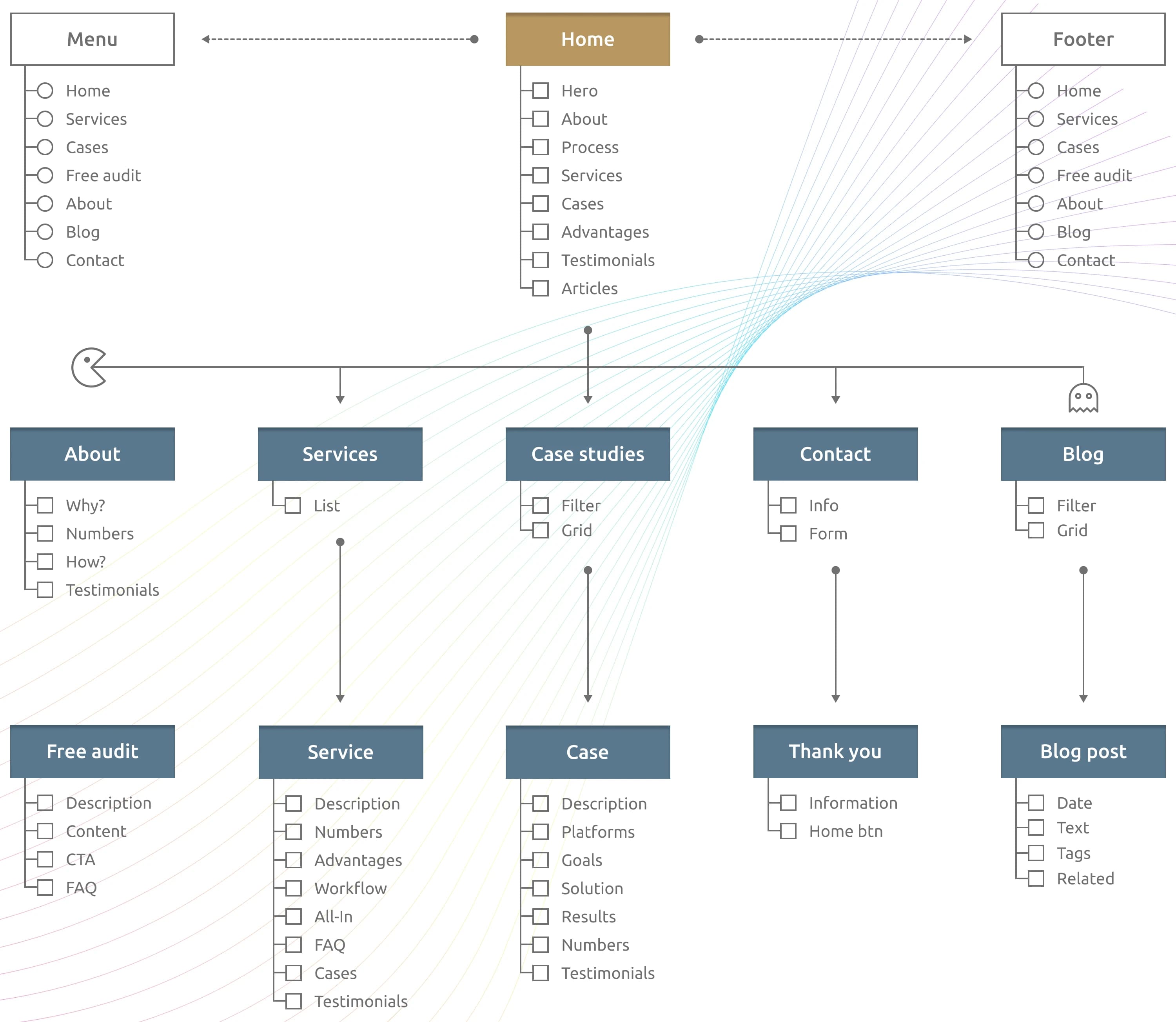
Sitemap
A flat, shallow sitemap by design. Most home-service owners arrive from an ad or a referral, not from organic discovery, so deep navigation isn't worth the maintenance cost. Three top-level sections, one audit CTA on every page, and case study pages indexed individually.
Structural Blueprint
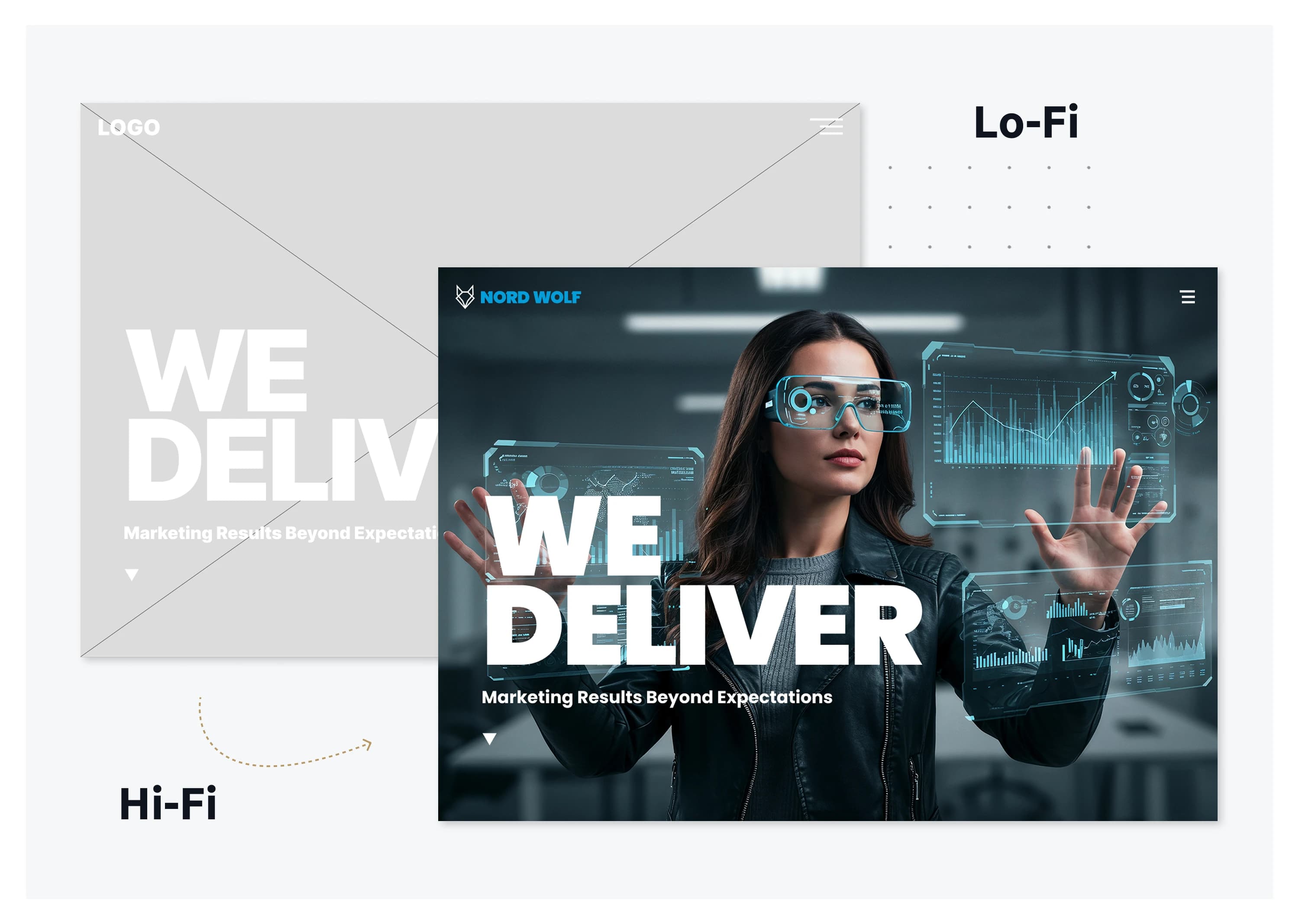
Lo-Fi Wireframes
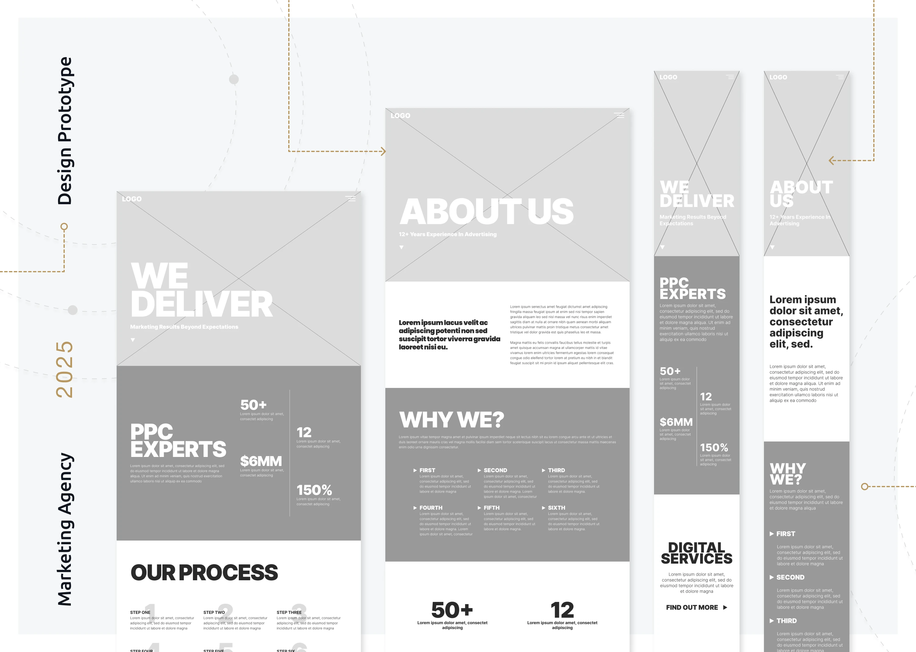
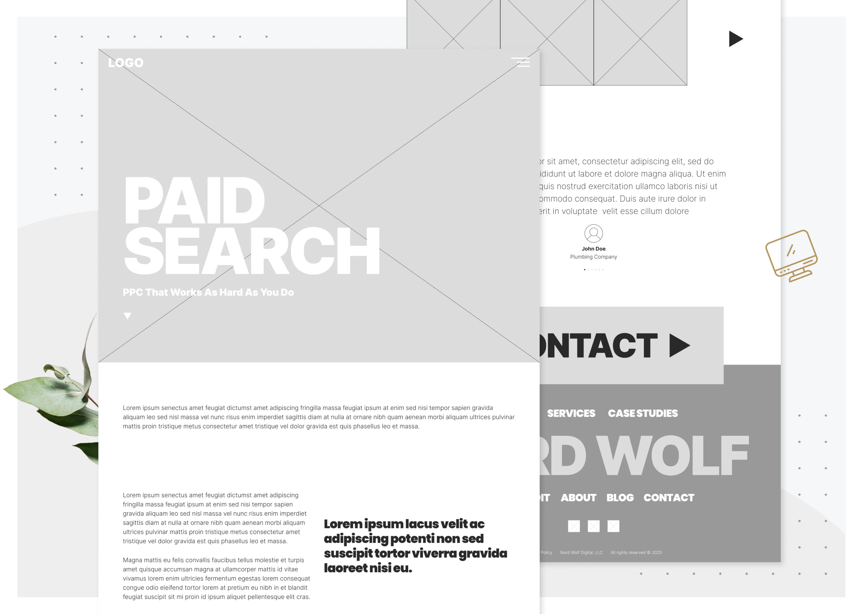
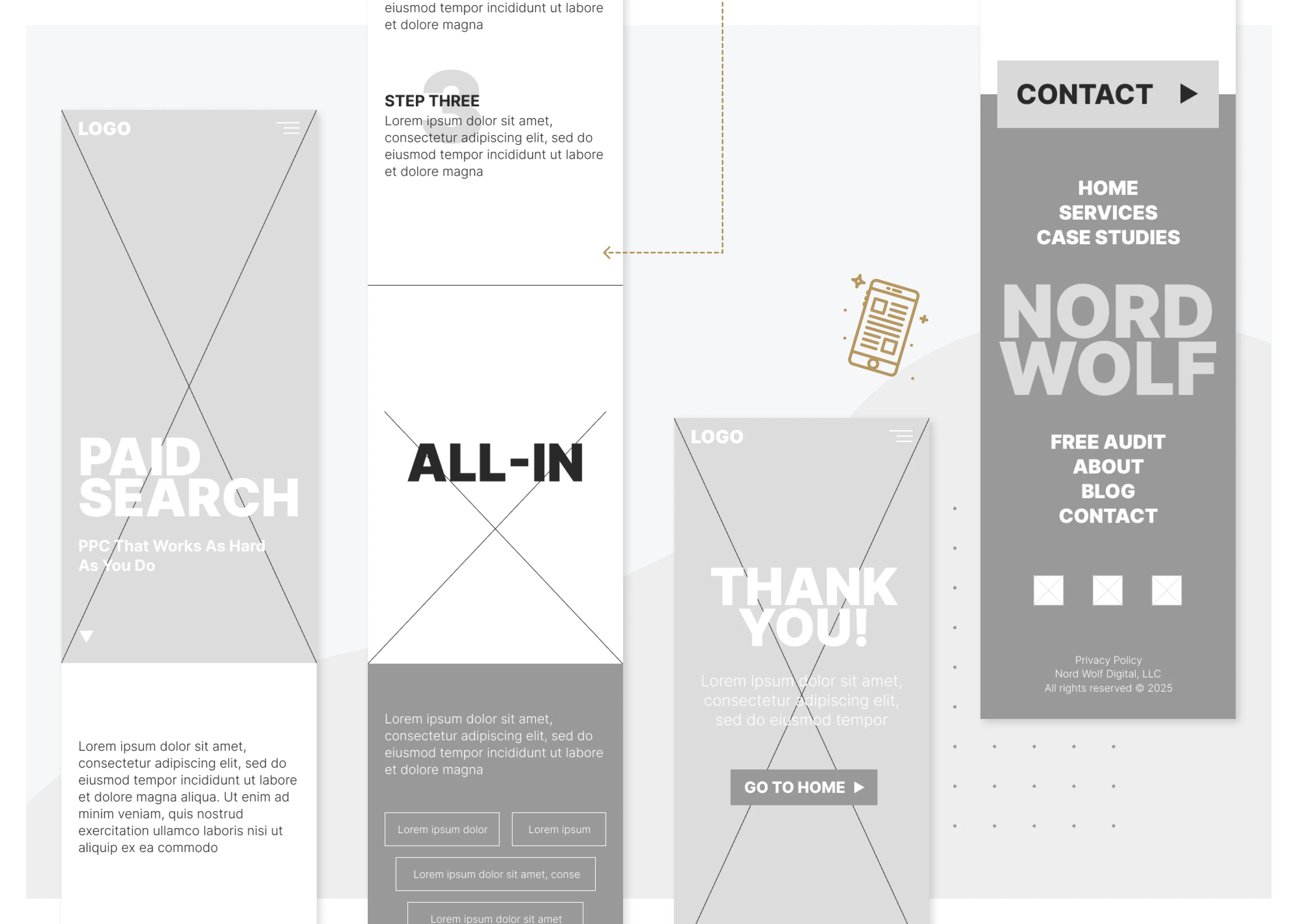
Full set of wireframes across every template: landing pages, service pages, case studies, contact. Structure-only, no styling. Locked hierarchy before the design system got applied, which kept hi-fi from drifting later.
New Brand Identity
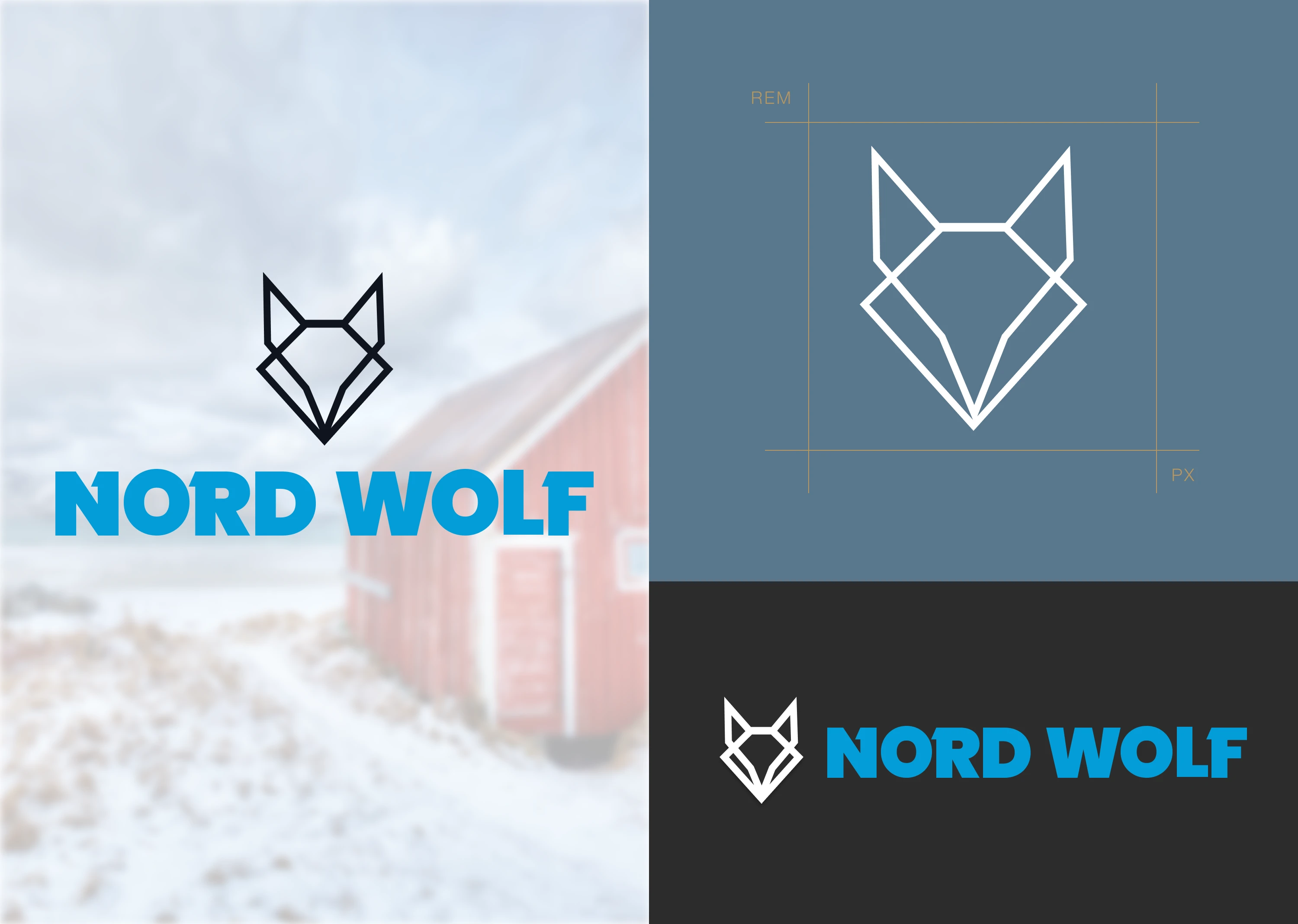
Logo Design
The old logo was flat and read junior. The new mark is bolder, simpler, and built from strong geometric lines. Designed to hold up at favicon size on a phone and at billboard size on swag. Paired with a confident type stack that does most of the brand work.
Visual Design
Hi-Fi Wireframes
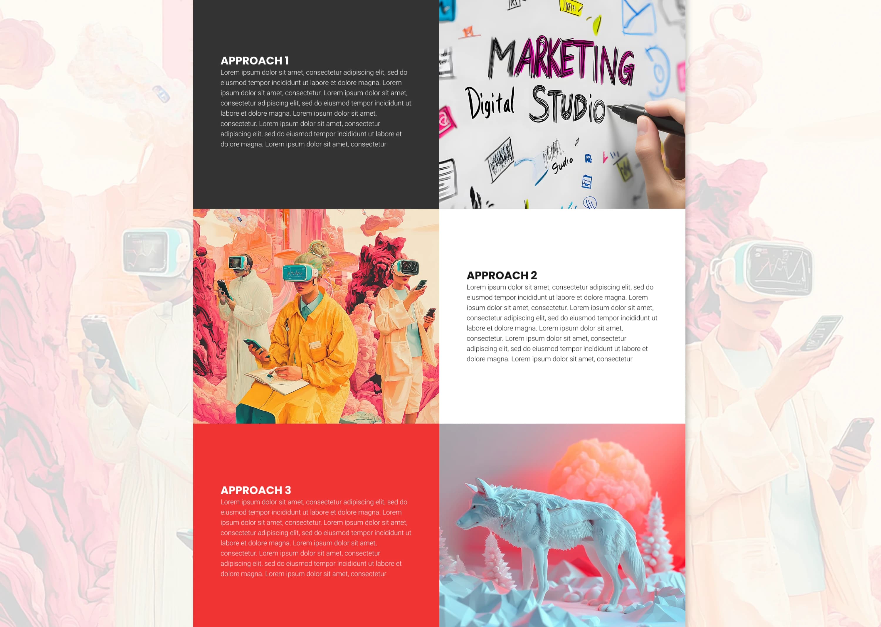
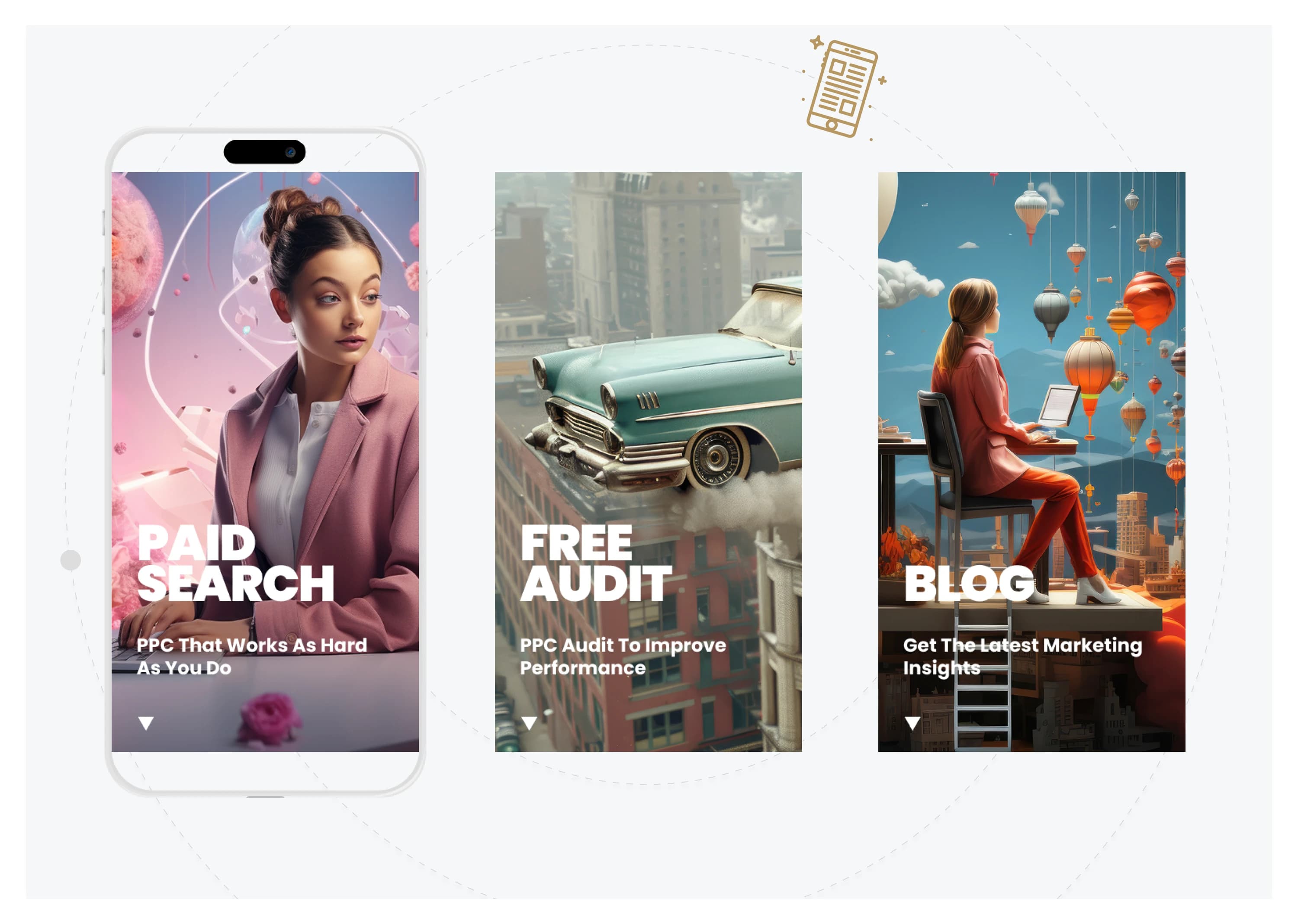
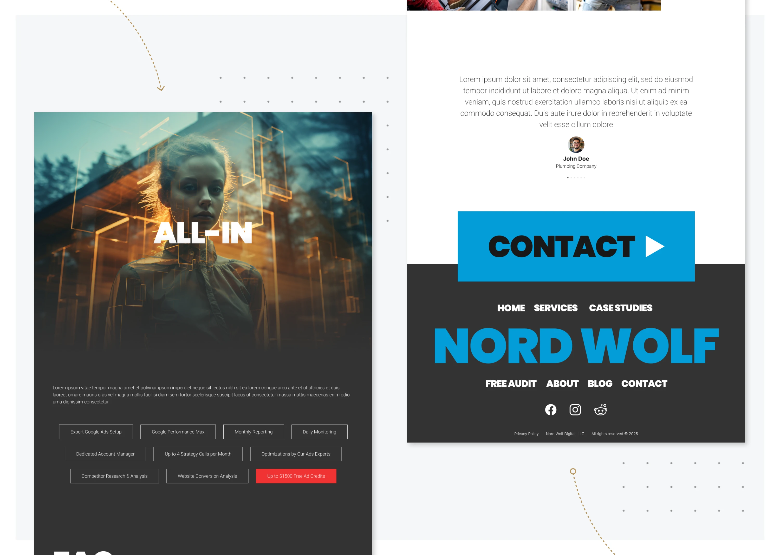
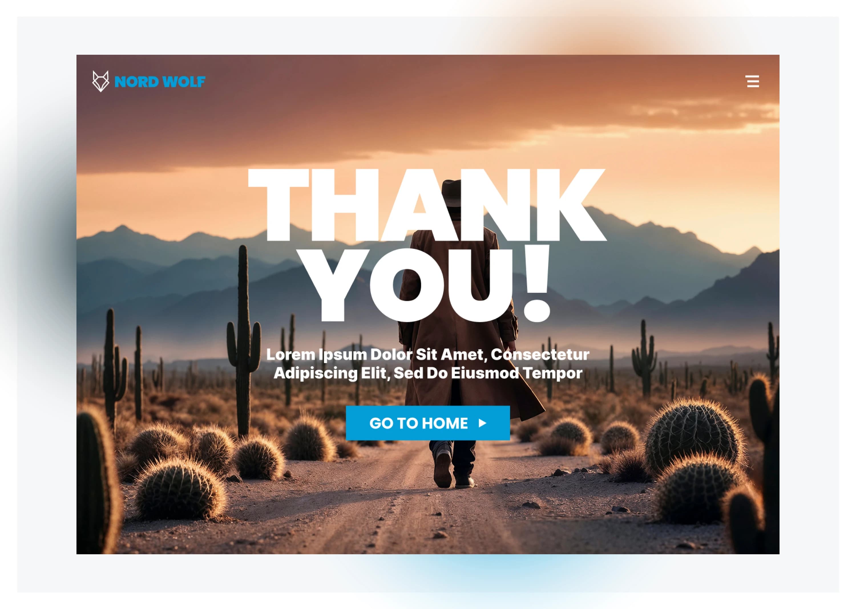
Hi-fi built directly off the lo-fi structure with the design system applied. Strong headlines, real numbers in case studies, low-friction CTAs. MidJourney and Nano Banana generated the hero visuals to push the site past the generic agency-stock look. That visual choice does a lot of the differentiation work in a crowded local market.
STACK & TOOLING
FigmaAdobe CSMidJourneyNano Banana~40-component design system
Achievements
Summary
The rebuild took Nord Wolf Digital from "results without a brand" to "results plus the visual identity to back them up." The new site reads in two seconds: who they help, what they deliver, proof. The design system carries that consistency across landing pages, service pages, and reports, and the brand work (logo, type, AI-generated hero visuals) gives the agency a distinct voice in a market mostly full of stock-photo competitors.
REFLECTION · What I learned
What I learned
- AI image tools earn their place fastest in saturated visual markets. Local marketing agencies all look the same; MidJourney and Nano Banana gave Nord Wolf a visual identity that the budget wouldn't otherwise have bought.
- Personas only matter when they drive decisions. The three personas here each map to a specific homepage decision, which is the bar I now hold all persona work to.
- The 'explain the UX process to the reader' framing has a place, but not on a senior portfolio. The next iteration of this case study will lead with decisions, not deliverables.